Rebranding online banking

The initial goal
In the recent years many companies have joined the group and made the company evolve from a local software provider into a global Financial Technology. It was time for them to create an identity that was representative of this diversity.

The logo
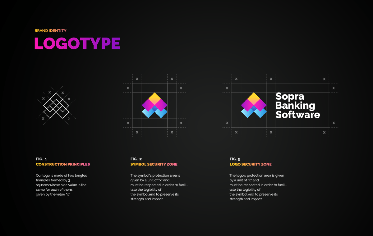
In collaboration with the agency’s design team, I designed a logomark that represented the transition from legacy to digital and symbolised the different activities by the juxtaposition of coloured blocks forming a unique entity.

Typography
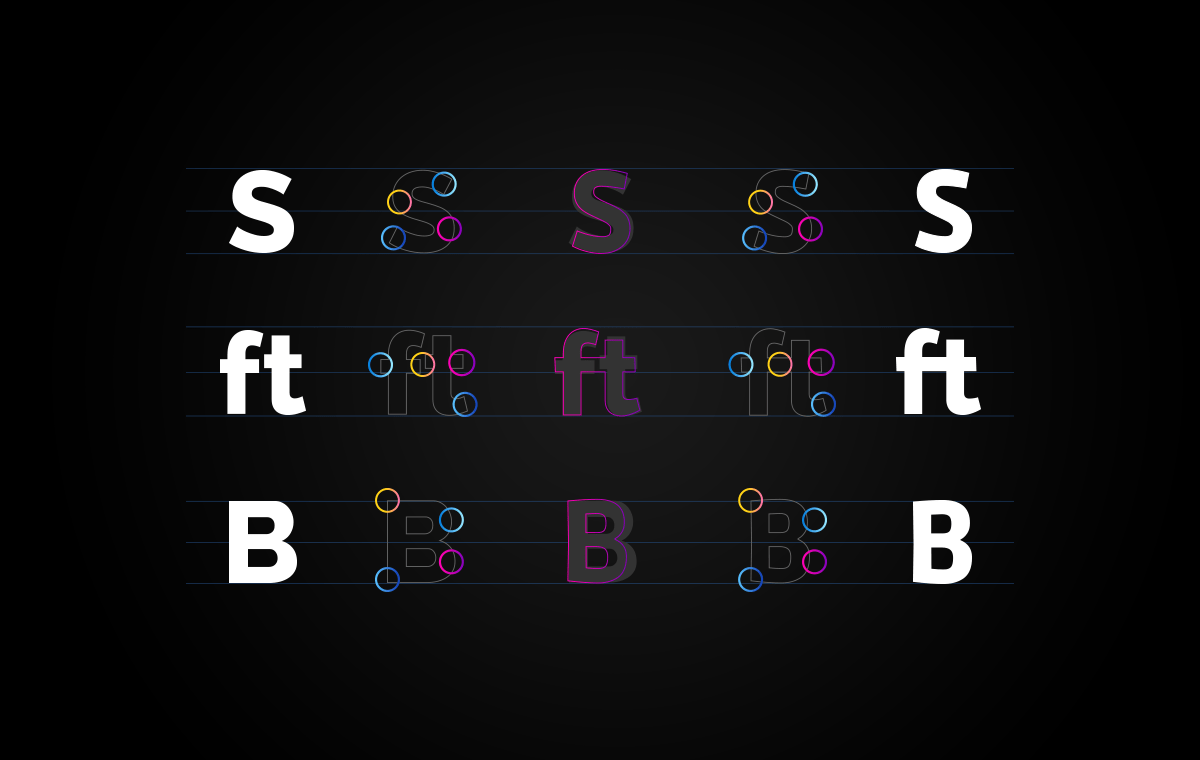
The logo’s typography has been reworked to soften some characters’ shapes. This results in a unique look and feel and contrasts with the angular logomark. Character spacing has also been enhanced for better readability.

Symbols
To keep a brand coherence while giving each sector of the company a unique identity, I automated the generation of more than 460 variations of the symbol on a grid. I then hand picked the best ones and attributed them to the different sub-brands.

Brand Guidelines
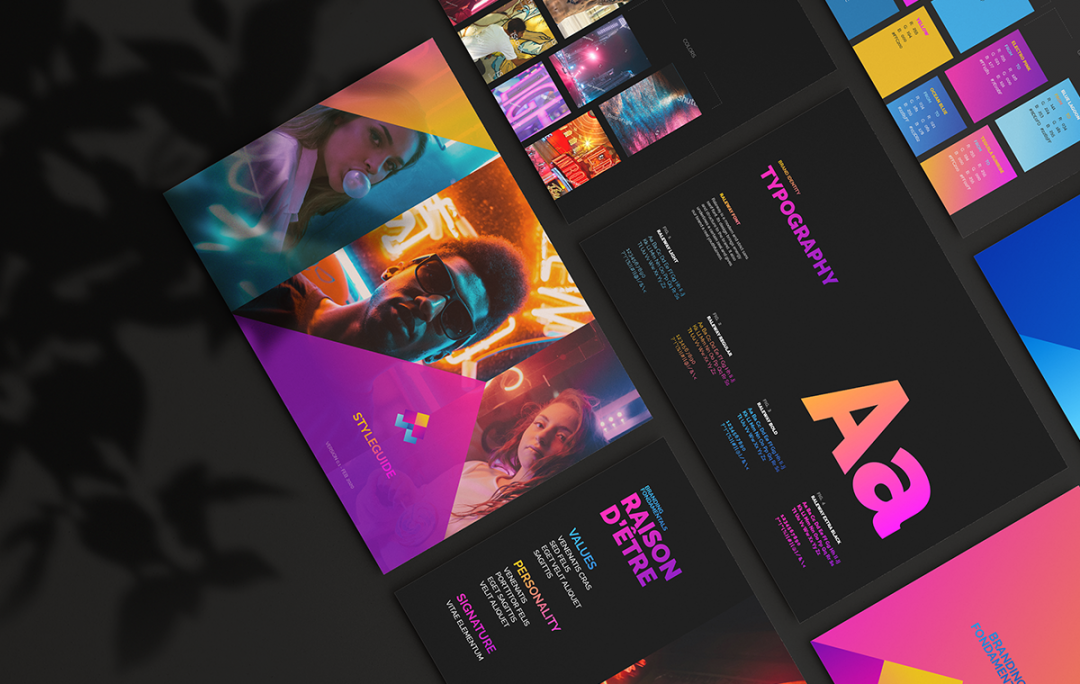
Beyond the logo and fonts, I developed a contemporary visual universe which I summarized and explained in the brand guidelines. Each page specifies how to (and not to) use the visual assets and maintain brand consistency through the use of colour palettes, Typography, imagery and ton of voice.

“ Thank you for your work, you managed to give life to the identity I have been struggling with for months”
Virginie PranchinVP Marketing
let's work together!
Do you want me to contribute to your project's sucess?
Get in touch and let’s see what we can do together.